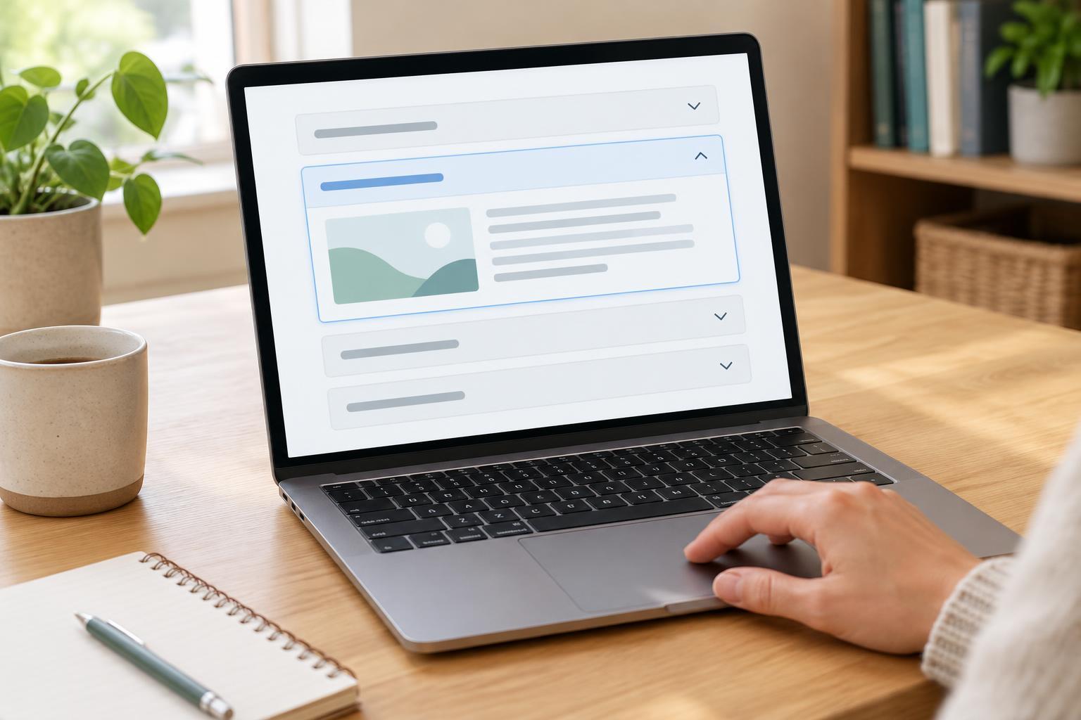
User ExperienceAccordions can make a page easier to scan, but they can also hide information visitors need. Learn when to use expandable sections, how to label them, and what to check before publishing.
Read article · 4 min↗
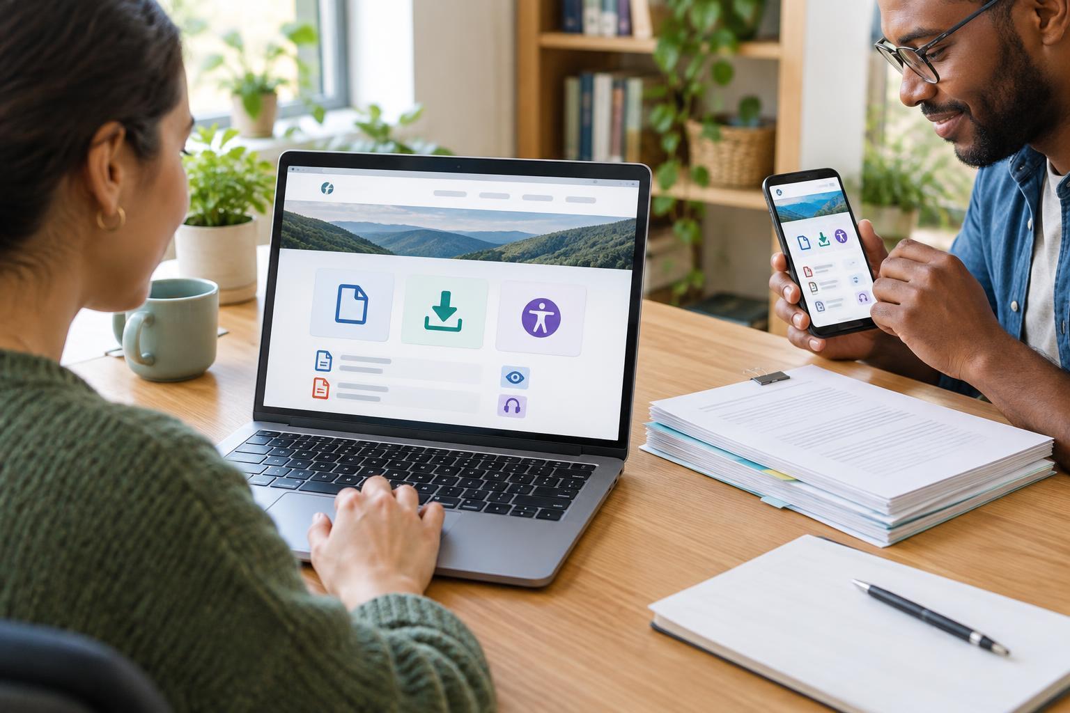
User ExperienceA downloadable file should help visitors complete a task, not send them on a hunt for the right version or a way to open it. Use this practical workflow to plan download links, explain file formats, provide useful alternatives and check the experience before publishing.
Read article · 3 min↗
User ExperienceA small website can be difficult to use even when every page looks polished. Learn how unclear navigation, hard-to-read content, demanding forms and fragile mobile interactions get in visitors’ way—and how to find and fix those problems.
Read article · 4 min↗
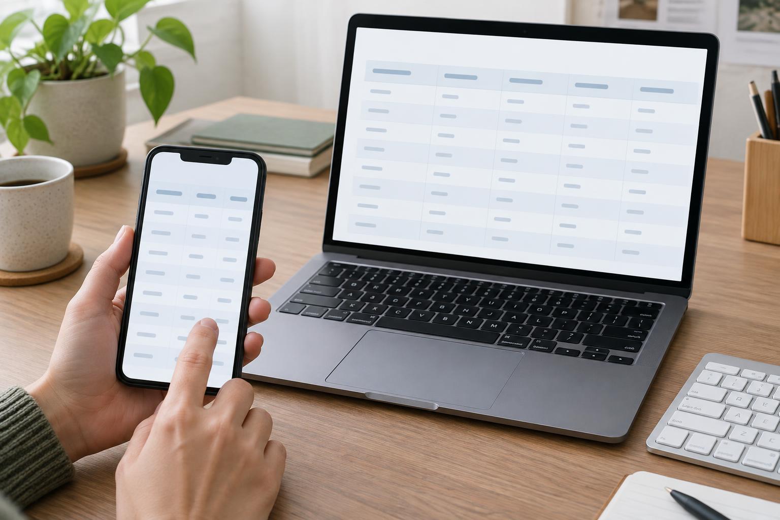
User ExperienceA useful data table should let people compare information without losing track of what each value means. Learn how to choose a clear structure, handle narrow screens, and check the result with a keyboard and screen reader.
Read article · 4 min↗
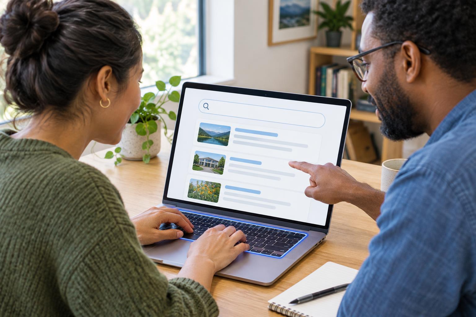
User ExperienceA good on-site search helps visitors find the right page without knowing how your website is organized. This guide covers when search is worth adding, how to design the search box and results, and how to test the experience with real questions.
Read article · 4 min↗
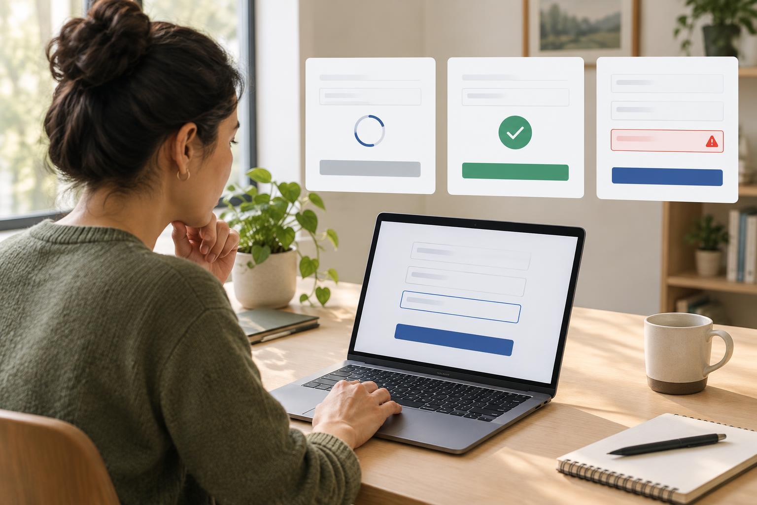
User ExperienceA form or button needs to communicate what happens after someone uses it. Learn how to plan loading, success and error states that reduce uncertainty, help people recover and work for visitors using keyboards and assistive technology.
Read article · 4 min↗

User ExperienceYou do not need a lab to learn where visitors get stuck. This guide shows how to choose realistic tasks, invite a few participants, observe without leading them, and turn what you learn into useful website improvements.
Read article · 4 min↗
User ExperienceYou do not need to be a screen reader expert to find and fix basic website barriers. This beginner-friendly workflow shows small teams how to prepare a test, explore a page, check a key task, and turn observations into useful fixes.
Read article · 4 min↗
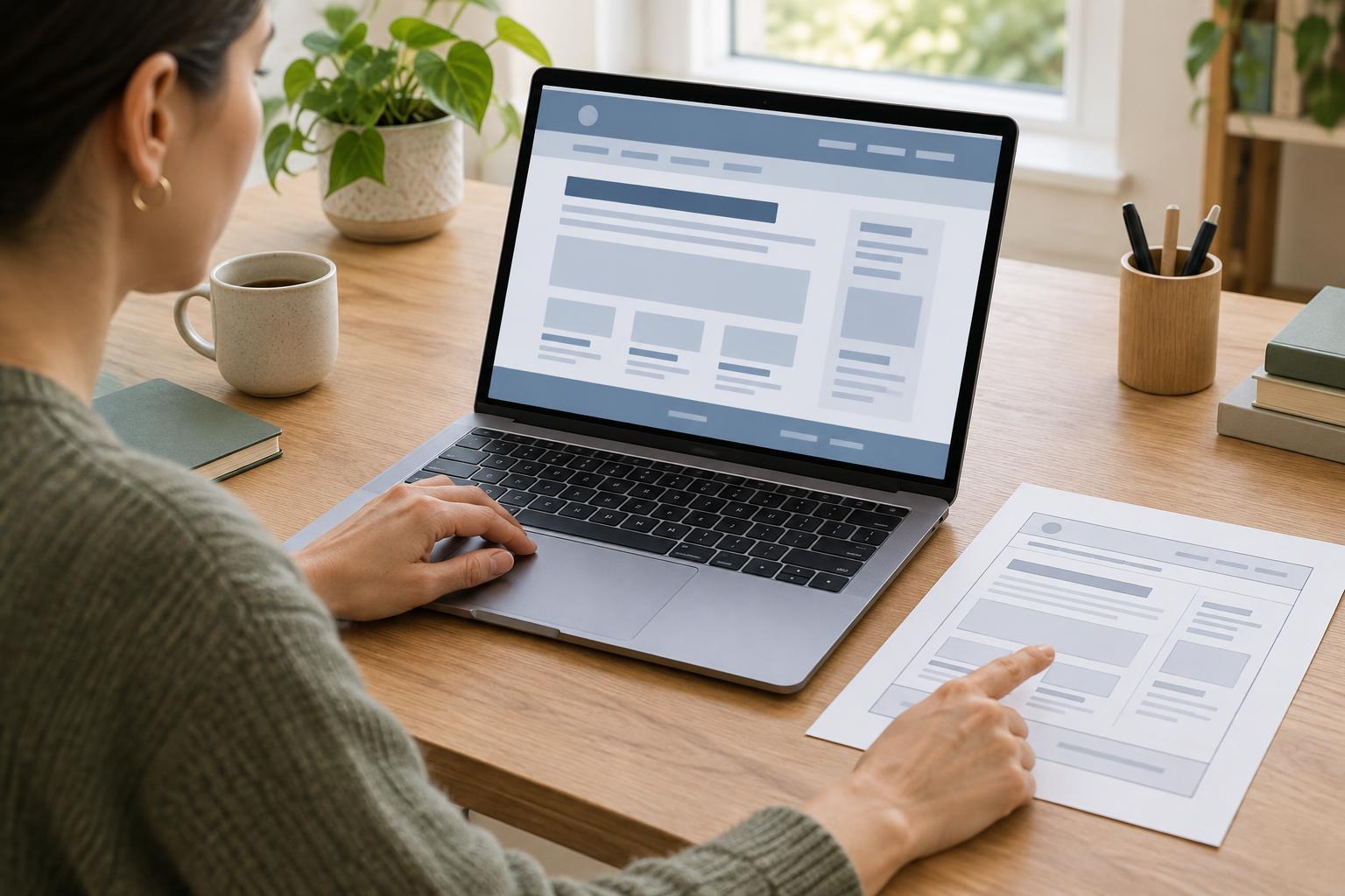
User ExperienceClear headings and page landmarks make a website easier to scan and can give assistive technology users faster ways to reach the content they need. Learn how to plan a page structure, mark it up, and check that it works.
Read article · 4 min↗
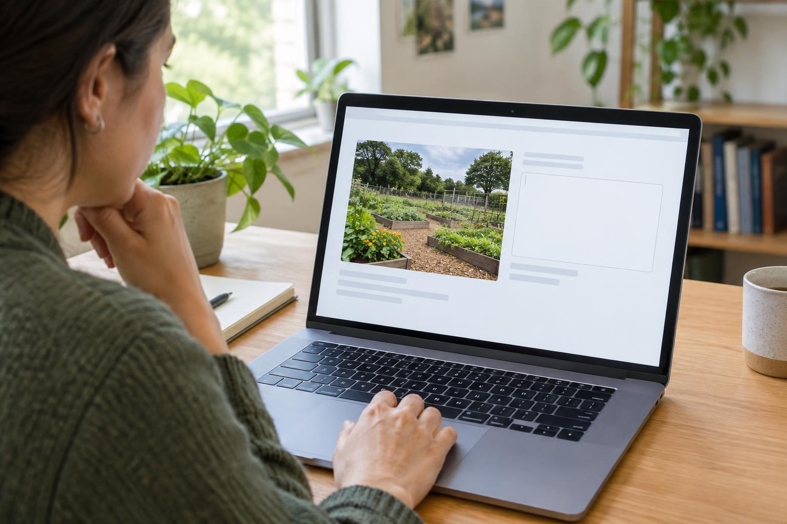
User ExperienceAlternative text helps people understand images they cannot see. Learn how to decide which images need a description, write text that serves the page, and check it during your publishing workflow.
Read article · 4 min↗
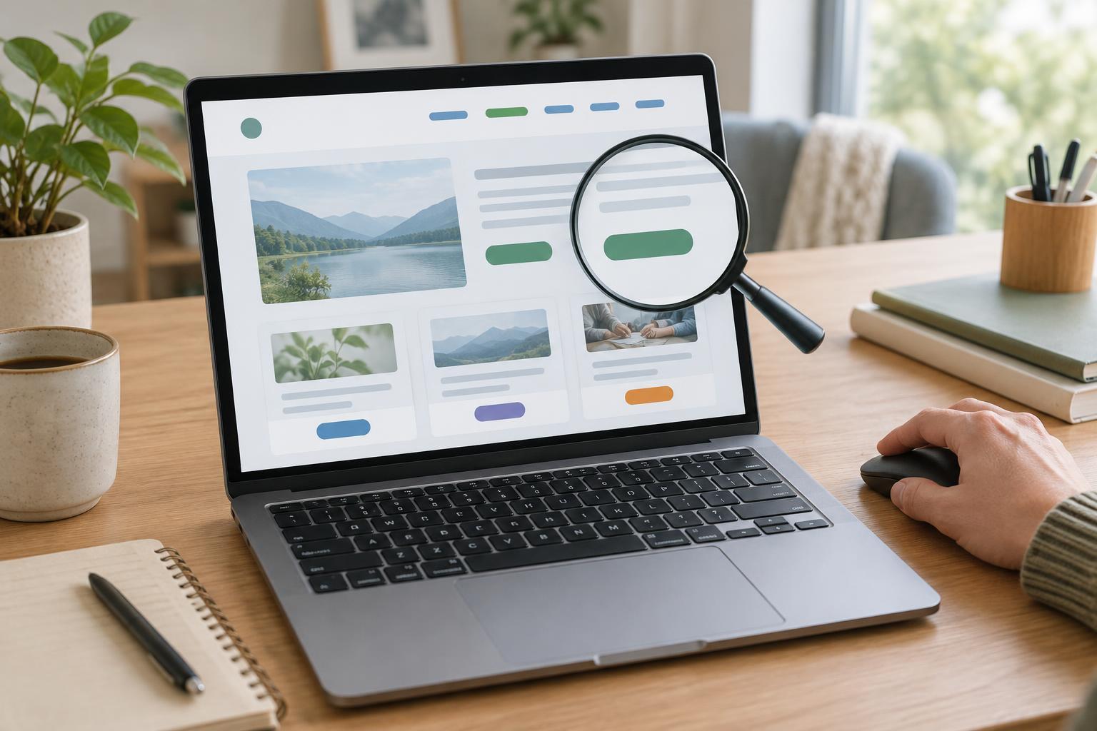
User ExperiencePeople often scan a page rather than read every sentence, and some navigate by moving through links or controls. Learn how to write clear labels, handle repeated actions and icon buttons, and check whether each control still makes sense on its own.
Read article · 4 min↗
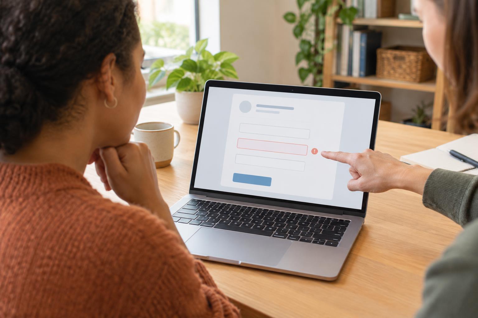
User ExperienceA useful form error message tells someone what went wrong, where to look, and how to continue. This guide shows small teams how to write, place, and test messages for common form problems without blaming the person filling out the form.
Read article · 5 min↗
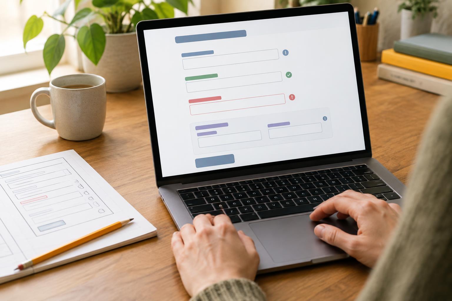
User ExperienceA useful form makes it easy to understand what to enter, why it is needed, and how to fix a mistake. Learn a practical workflow for improving labels, instructions, field groups, and error messages on a small organization’s website.
Read article · 4 min↗

User ExperienceA visible focus indicator helps keyboard users see where they are and what will happen next. Learn how to plan, style and check focus across links, forms, menus and other interactive parts of a small organization’s website.
Read article · 4 min↗
User ExperienceA keyboard-only check can reveal navigation barriers that are easy to miss with a mouse. Follow a page from start to finish, test common tasks, record where you get stuck, and use the results to prioritize fixes.
Read article · 4 min↗
User ExperienceA practical workflow for checking whether website text and buttons remain readable across pages, images and interaction states—and for fixing problems without redesigning everything.
Read article · 4 min↗
User ExperienceReadable website text is not just a matter of picking a font. Type size, line length and spacing work together to help visitors scan a page and read it comfortably. Use these practical starting points and a simple testing workflow to improve pages across desktop and mobile screens.
Read article · 4 min↗
User ExperienceA touch-friendly interface does more than make buttons bigger. Learn how to size controls, separate nearby actions, handle text links and test common tasks on a small screen.
Read article · 4 min↗
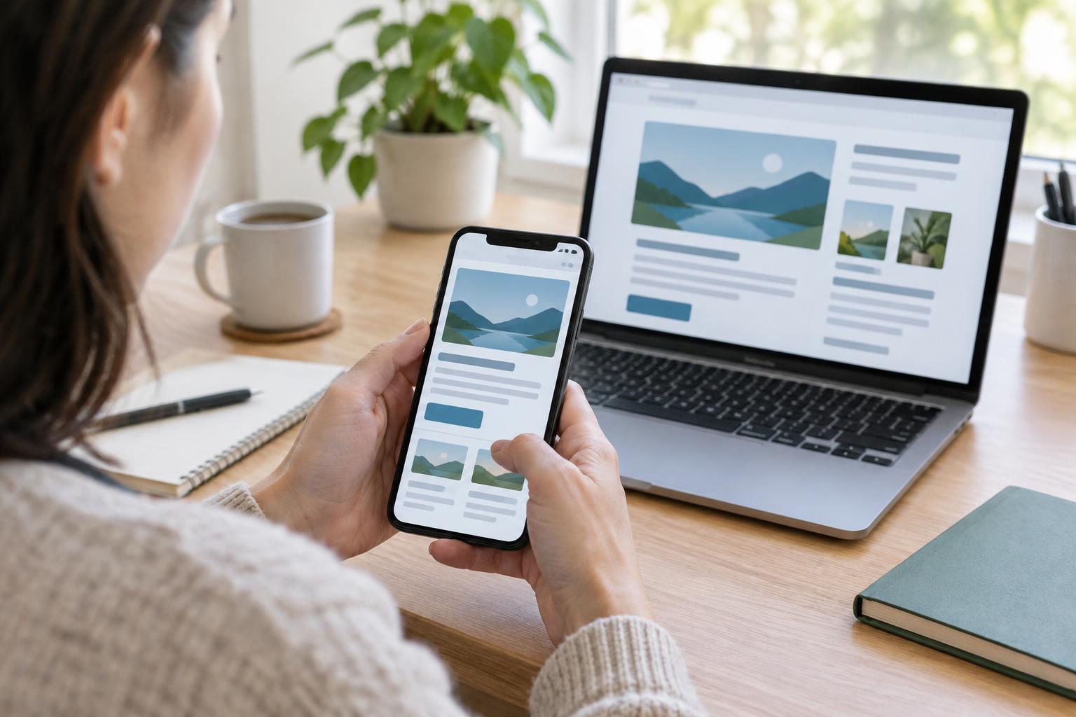
User ExperienceA mobile page should let visitors read, navigate and complete tasks at a comfortable size. Learn how to plan a flexible layout, handle wide content and test for the problems that make people pinch or scroll sideways.
Read article · 4 min↗
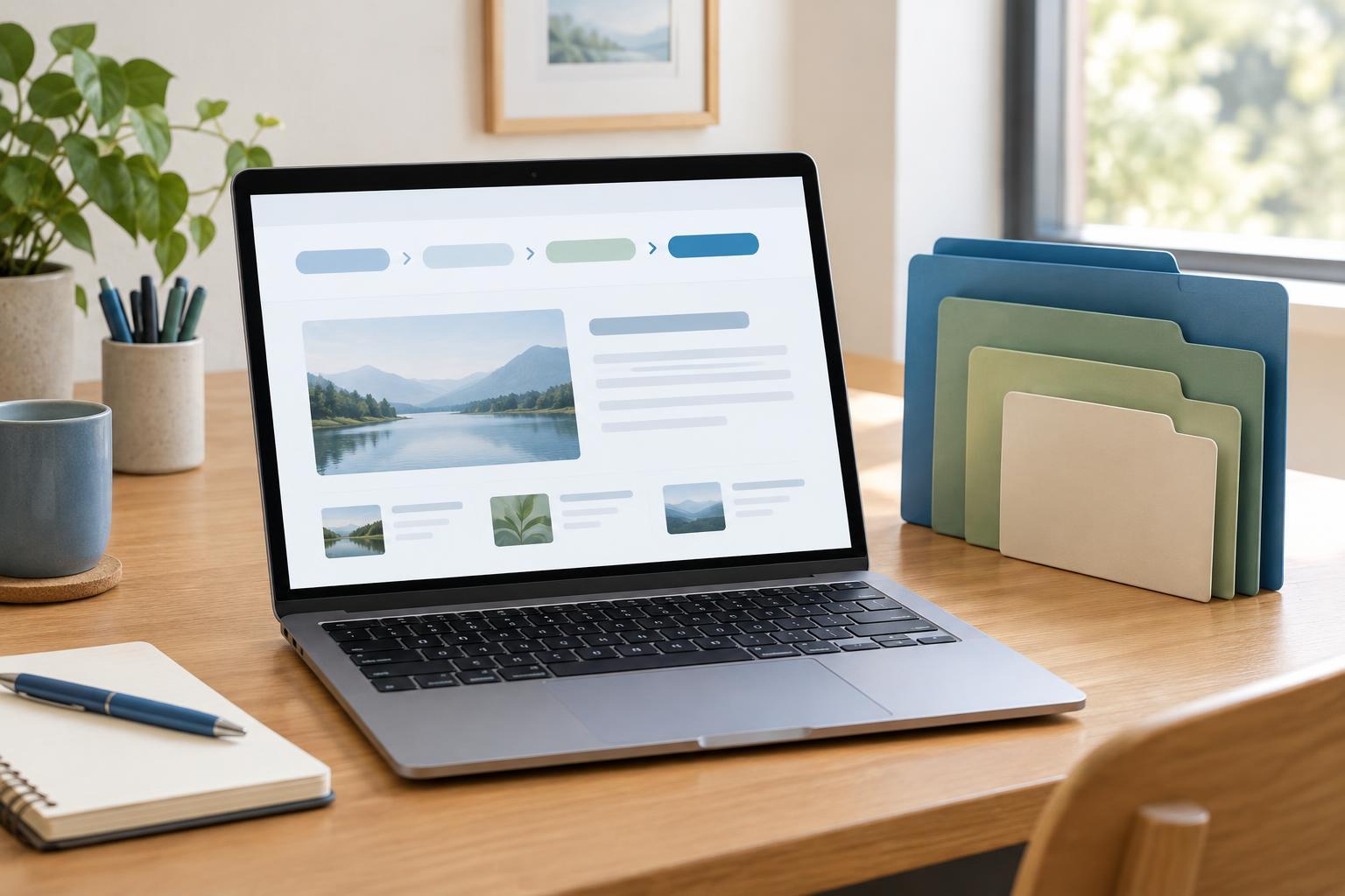
User ExperienceBreadcrumbs can show visitors how a page fits into a larger site and offer a quick route to broader topics. Learn when they are useful, when they add clutter, and how to make them clear and accessible.
Read article · 4 min↗
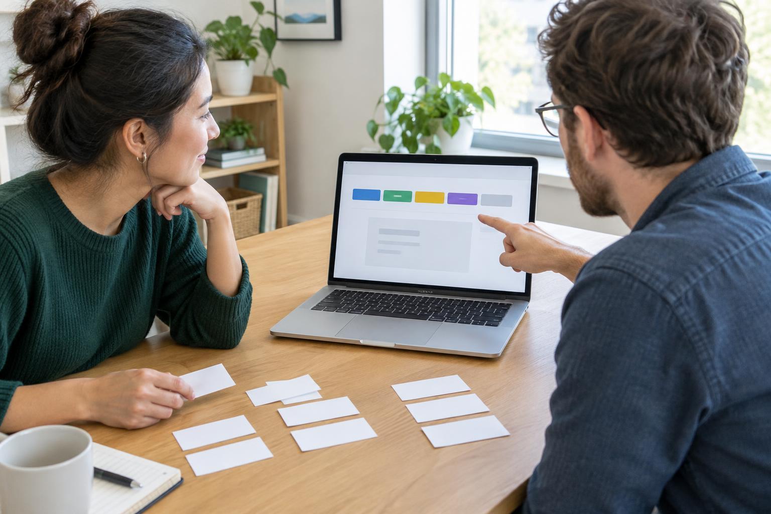
User ExperienceA website menu is most useful when visitors can predict what they will find behind each link. Learn how to replace internal jargon with clear labels, check your choices with real tasks, and keep navigation consistent as your site grows.
Read article · 4 min↗
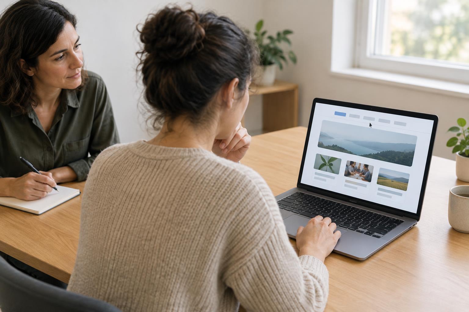
User ExperienceA website menu may feel obvious to the people who built it but puzzling to someone arriving for the first time. This guide shows small organizations how to choose realistic tasks, observe a simple navigation check, spot recurring problems and make focused improvements.
Read article · 4 min↗